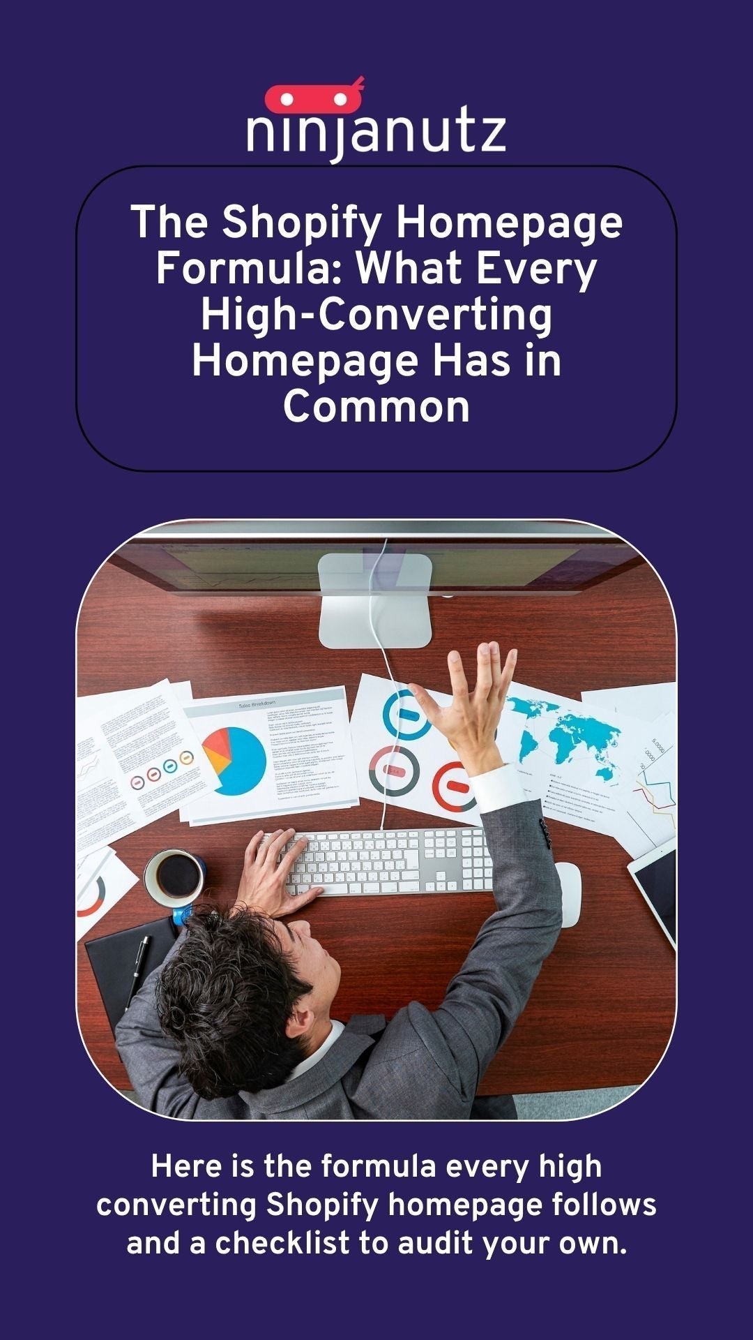
The Shopify Homepage Formula: What Every High-Converting Homepage Has in Common
This post may contain affiliate links and we may earn a small commission when you click on the links at no additional cost to you.
Published by NinjaNutz Digital Inc. | Toronto, ON
The Short Answer
A high-converting Shopify homepage does five things in order: it tells visitors immediately what you sell and who it is for, it builds trust before asking for anything, it guides visitors toward the right product without overwhelming them, it removes every reason not to buy, and it works as well on mobile as it does on desktop.
Most Shopify homepages fail at two or three of these. Some fail at all five. Here is exactly what each one looks like in practice and how to audit your own homepage against it.
Why Your Homepage Matters More Than Any Other Page
Your homepage is not your most visited page in absolute terms. Product pages and collection pages often get more direct traffic from search.
But your homepage is the page that sets the standard for everything else. It is where most paid traffic lands. It is where brand new visitors form their first impression. It is the page a potential customer checks when they want to know if your store is legitimate before they buy.
A homepage that fails to communicate clearly, build trust quickly, and direct visitors confidently does not just lose that visit. It undermines every other page on your store.
The Formula: Seven Elements Every High-Converting Shopify Homepage Needs
1. A Clear Value Proposition Above the Fold
The single most important question your homepage answers is: what do you sell, who is it for, and why should I care?
A visitor who lands on your homepage has approximately three seconds to decide whether to stay or leave. In that window, they need to understand what your store is about without scrolling, clicking, or reading past your hero section.
What good looks like: A headline that names the product category or the specific benefit. A subheading that adds context about who it is for or what makes it different. A hero image or video that shows the product in context rather than on a white background. A primary call to action that tells the visitor exactly what to do next.
What bad looks like: A hero section that leads with your brand name and a vague tagline like "quality for life" or "made with love." These say nothing about what you sell. A visitor who does not immediately understand your store will leave rather than figure it out.
The test: Show your homepage to someone who has never seen it for three seconds and then ask them to tell you what the store sells. If they cannot answer clearly, your value proposition is not working.
2. Trust Signals in the First Scroll
First-time visitors do not trust you yet. That is not a problem. It is a given. The job of your homepage is to earn trust quickly and consistently throughout the experience.
Trust signals need to appear within the first one to two scrolls. Saving them for the bottom of the page means most visitors never see them.
High-impact trust signals:
- Star ratings and review counts, ideally with a direct quote from a real customer
- Press mentions or media logos, if you have them
- A specific number that builds credibility: years in business, number of customers served, orders shipped
- Clear shipping and return policy visibility, not buried in the footer
- Recognizable payment method icons near the call to action
The trust signal most stores miss: A real human face connected to the brand. Founder stories, team photos, or even a face in lifestyle photography communicates that real people stand behind the products in a way that anonymous product grids never do.
3. A Guided Path to the Right Product
One of the most common homepage mistakes is presenting everything at once. Every collection. Every product. Every promotion. Every brand message simultaneously.
More choices create more paralysis. A visitor who does not know where to start often does not start at all.
A high-converting homepage guides visitors toward the right product for them rather than presenting the entire catalogue and hoping they figure it out.
What good looks like: Three to five featured collections with clear, descriptive names rather than internal category labels. A "shop by" section that organizes by use case, recipient, or problem being solved. A featured product spotlight with a specific reason why this product is worth attention right now. A quiz or recommendation flow for stores where product selection is complex.
What bad looks like: A homepage with twelve collection tiles of equal visual weight, four promotional banners fighting for attention, and no clear direction for a first-time visitor who does not know where to begin.
4. Social Proof That Feels Real
Reviews and testimonials on a Shopify homepage are not optional. They are the difference between a visitor who considers buying and one who actually does.
But not all social proof is created equal. A generic five-star average with no context does less work than a specific review that names a real benefit or overcomes a real objection.
What good looks like: A dedicated reviews section with three to five featured testimonials selected because they address the most common purchase hesitations. Photo reviews where possible. A total review count that signals volume. Star ratings displayed near product calls to action, not just in a separate section at the bottom.
What bad looks like: No reviews on the homepage at all. Or a reviews carousel that loads slowly, looks visually inconsistent with the rest of the page, and features generic five-word reviews that say nothing specific.
The specificity rule: "Great product, fast shipping" does not move anyone. "I was skeptical but after two weeks I noticed a real difference, and I have already ordered three more" moves people. Curate your featured reviews for specificity and objection handling, not just star rating.
5. Objection Removal Before the Cart
Every visitor who leaves without buying had a reason. Most of those reasons are predictable and most of them can be addressed directly on the homepage before they become a barrier.
The most common purchase objections for first time Shopify customers:
Shipping cost and timeline. Address this visibly near the top of the page. A free shipping threshold displayed prominently removes the most common abandonment trigger before it fires.
Return policy uncertainty. First time buyers want to know they can return something if it does not work. A simple "free returns within 30 days" line near your call to action removes significant hesitation.
Product quality uncertainty. Lifestyle photography showing the product in real use, video demonstrations, and specific material or ingredient callouts all reduce the gap between "this looks nice online" and "I trust this enough to buy it."
Legitimacy uncertainty. For smaller or newer brands, visitors actively look for signals that you are a real business. A physical location, a named founder, a real customer service email, and a genuine about section all contribute to this.
6. A Homepage That Works on Mobile First
More than 70% of Shopify store traffic arrives on mobile. Most homepages are designed on a desktop and then adapted for mobile. The ones that convert best are designed for mobile first and then scaled up for desktop.
Mobile specific issues that kill conversions:
- Hero text that is too small to read without zooming
- Calls to action that are too small to tap comfortably with a thumb
- Navigation menus that require too many taps to reach a product
- Images that load slowly because they were not sized for mobile
- Pop-ups that cover the entire screen on mobile and are difficult to dismiss
The mobile test: Navigate your own homepage on your phone as if you were a first time visitor. Try to find a specific product, read the key trust signals, and get to checkout. Note every point of friction. Those friction points are costing you sales every day.
7. A Clear Secondary Path for Visitors Who Are Not Ready to Buy
Not every visitor who lands on your homepage is ready to buy today. Some are researching. Some are comparing. Some are discovering your brand for the first time and need more time.
A high converting homepage acknowledges this and provides a path for these visitors that keeps them connected to the brand.
What good looks like: An email capture that offers genuine value: a discount, early access, a guide, a quiz result. A brand story section that builds connection for visitors who want to know more before committing. A blog or content section that positions your store as a resource, not just a transaction.
The goal: A visitor who is not ready to buy today should leave with either your email in their list or a strong enough impression that they come back when they are ready.
The Homepage Audit Checklist
Use this to evaluate your current homepage against the formula:
Value proposition:
- Can a new visitor understand what you sell within three seconds?
- Does your headline communicate a specific benefit or product category?
- Does your hero image show the product in real context?
Trust signals:
- Are reviews or ratings visible within the first two scrolls?
- Is your shipping policy visible near the top of the page?
- Does a real person or founder appear on the homepage?
Navigation and product discovery:
- Does the homepage guide visitors rather than overwhelm them?
- Are collections organized by use case or customer need rather than internal category labels?
- Is there a clear primary call to action above the fold?
Social proof:
- Do featured reviews address specific objections rather than just praising the product generally?
- Are photo reviews used where available?
Objection removal:
- Is your free shipping threshold (if you have one) displayed prominently?
- Is your return policy easy to find?
Mobile experience:
- Does the homepage load quickly on mobile?
- Are all calls to action easy to tap on a phone screen?
- Is the hero text readable without zooming?
Secondary path:
- Is there an email capture with a genuine value offer?
- Is there a content or brand story section for visitors who need more time?
What to Do With This Checklist
If you went through the checklist and found two or three gaps, those are fixable with targeted changes to your current theme. If you found five or more, the issue is likely structural and a more thorough audit would tell you exactly what to prioritize and in what order.
That is what our Snapshot Report does. It benchmarks your homepage and every other key page against what high converting stores in your category are doing, identifies the specific gaps, and gives you a prioritized roadmap for what to fix first.
Frequently Asked Questions
What makes a Shopify homepage convert well? A high converting Shopify homepage communicates clearly what the store sells within the first three seconds, builds trust through reviews and credibility signals early in the page, guides visitors toward the right product without overwhelming them, addresses common purchase objections before they become barriers, and performs as well on mobile as on desktop.
What should be on a Shopify homepage? At minimum: a clear value proposition above the fold, featured collections or products with a guided path to purchase, trust signals including reviews and shipping policy, social proof from real customers, and an email capture for visitors who are not ready to buy immediately.
What is a good Shopify homepage conversion rate? Average ecommerce conversion rates sit between 1% and 3%. Shopify stores with well optimized homepages and strong product market fit can reach 3% to 5%. Anything above 5% is exceptional. Below 1% on consistent traffic is a strong signal that the homepage has structural issues worth investigating.
How long should a Shopify homepage be? Long enough to answer the key questions a first time visitor has, short enough that the most important elements appear within the first two scrolls on mobile. Most high converting Shopify homepages are between five and eight sections. Beyond that, content competes for attention rather than adding value.
Why is my Shopify homepage not converting? The most common reasons are: a value proposition that does not communicate clearly what you sell, trust signals that appear too late in the page or not at all, a product discovery structure that overwhelms rather than guides, poor mobile experience, and no mechanism for capturing visitors who are not ready to buy immediately.
Should I put my best selling products on the Shopify homepage? Yes, but with context. Best selling products work well on the homepage when they are presented with a specific reason why they are worth attention: a review, a benefit callout, a "most popular" or "staff pick" label. A grid of product images without context does less conversion work than a smaller curated selection with supporting information.
Work With NinjaNutz Digital
NinjaNutz Digital Inc. is a Toronto based Shopify agency operating since 2014. Every theme redesign we deliver is built around the homepage formula above, with CRO principles applied to every section decision.
If you want to know exactly where your current homepage is falling short and what to fix first, our Snapshot Report gives you a full audit with a prioritized roadmap.
NinjaNutz Digital Inc. is based in Toronto, Ontario. We serve Shopify merchants across Canada and internationally.
Leave a comment
All comments are moderated before being published.
This site is protected by hCaptcha and the hCaptcha Privacy Policy and Terms of Service apply.